On the Attraction of Mountains (and anniversaries for two of them)

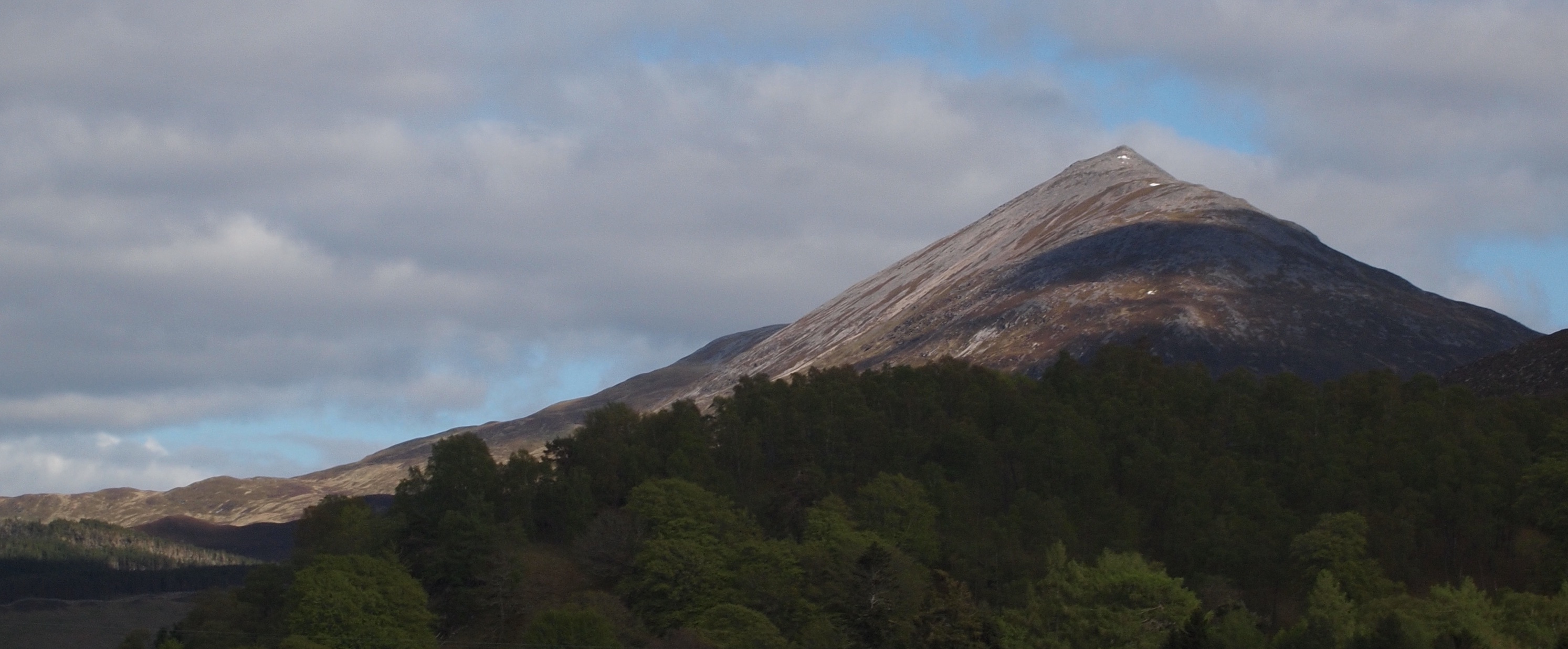
My blog began with a tale of the contouring of Schiehallion in Scotland. It is a mountain that has proved itself very attractive on many occasions. Another magnificent peak is Slieve Sneacht in Ireland, and both are associated with momentous mapping innovations that have anniversaries this year. 

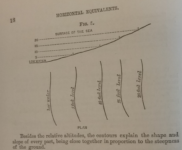
2024 marks 250years since astronomer royal, Nevil Maskelyne, began his “astronomical experiment of the attraction of a mountain”. His task was not to devise a system for rating beauty, rather to oversee an experiment to gauge the weight of the earth. From observatories erected high up on Schiehallion’s north and south facing flanks, Maskelyne charted the position of stars. Having ascertained their heavenly positions, he used these as a measure for minute deflections from vertical in a plumbline, thus assessing the mountain’s mass through horizontal gravitational force. My knowledge of how the experiment worked is limited because what had piqued my interest was a by-product of it. My focus was the mathematician, Charles Hutton. He had been tasked with mapping the volume of the mountain, and aided by the meticulous measurements of surveyors, he derived a novel solution for it. He wrote of “connecting together … all the points [spot heights] which were of the same relative altitude.” His contour lines were likely the first drawn on a practical terrestrial map. (The anniversary of the creation of his map will be a few years beyond the beginning of the experiment.)

From J. H. Andrews, A Paper Landscape: The Ordnance Survey in Nineteenth-Century Ireland, (1975; Dublin: Four Courts Press, 2006)

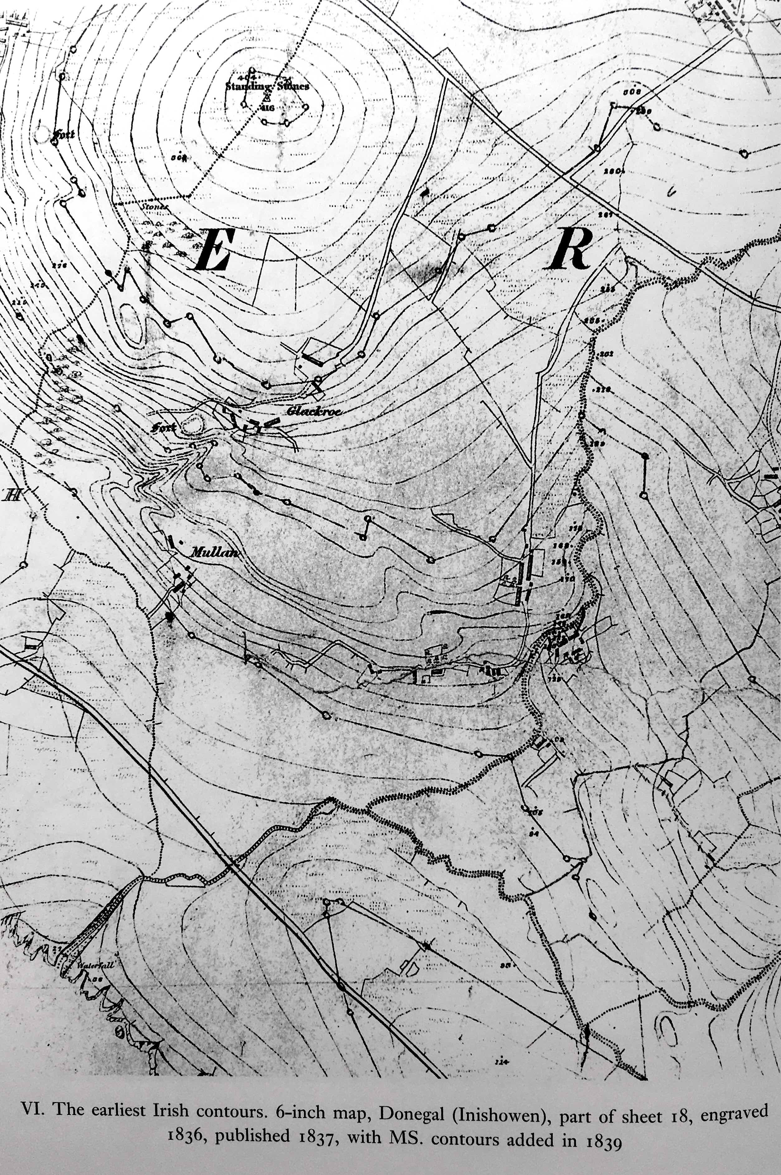
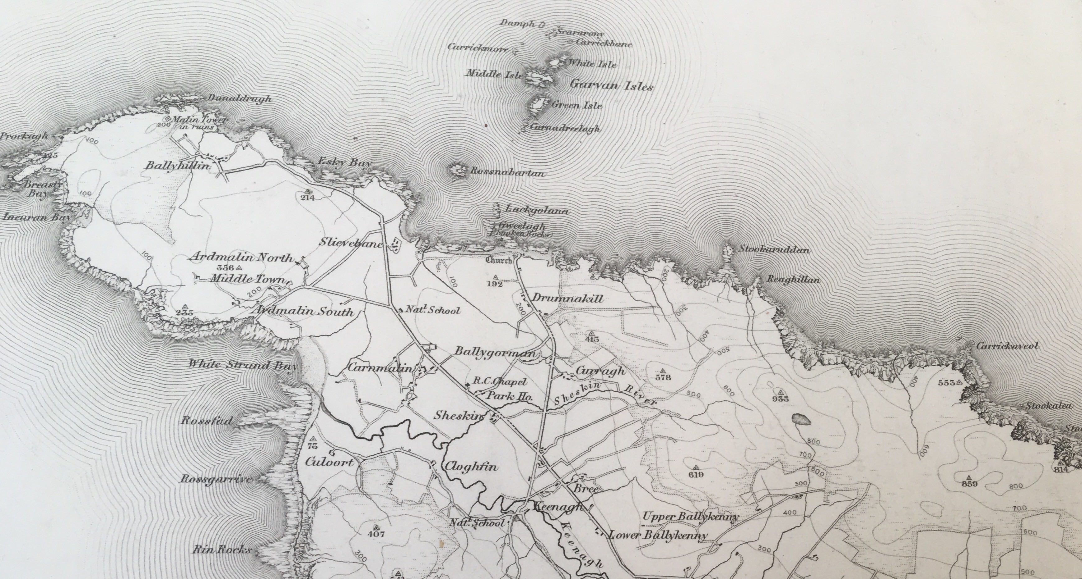
The other attractive mountain with an anniversary pending is Slieve Sneacht on the Inishowen Peninsula in Donegal, Ireland. Two hundred years ago, the Ordnance Survey shifted the focus of their mapping activities from England to Ireland. If you look at their printed sheet numbers, no. 1 – in any series of Ireland – begins with Malin Head at the tip of the Peninsula. It is as though the upper lefthand corner of Ireland becomes the ‘once upon a time’ of a story. 

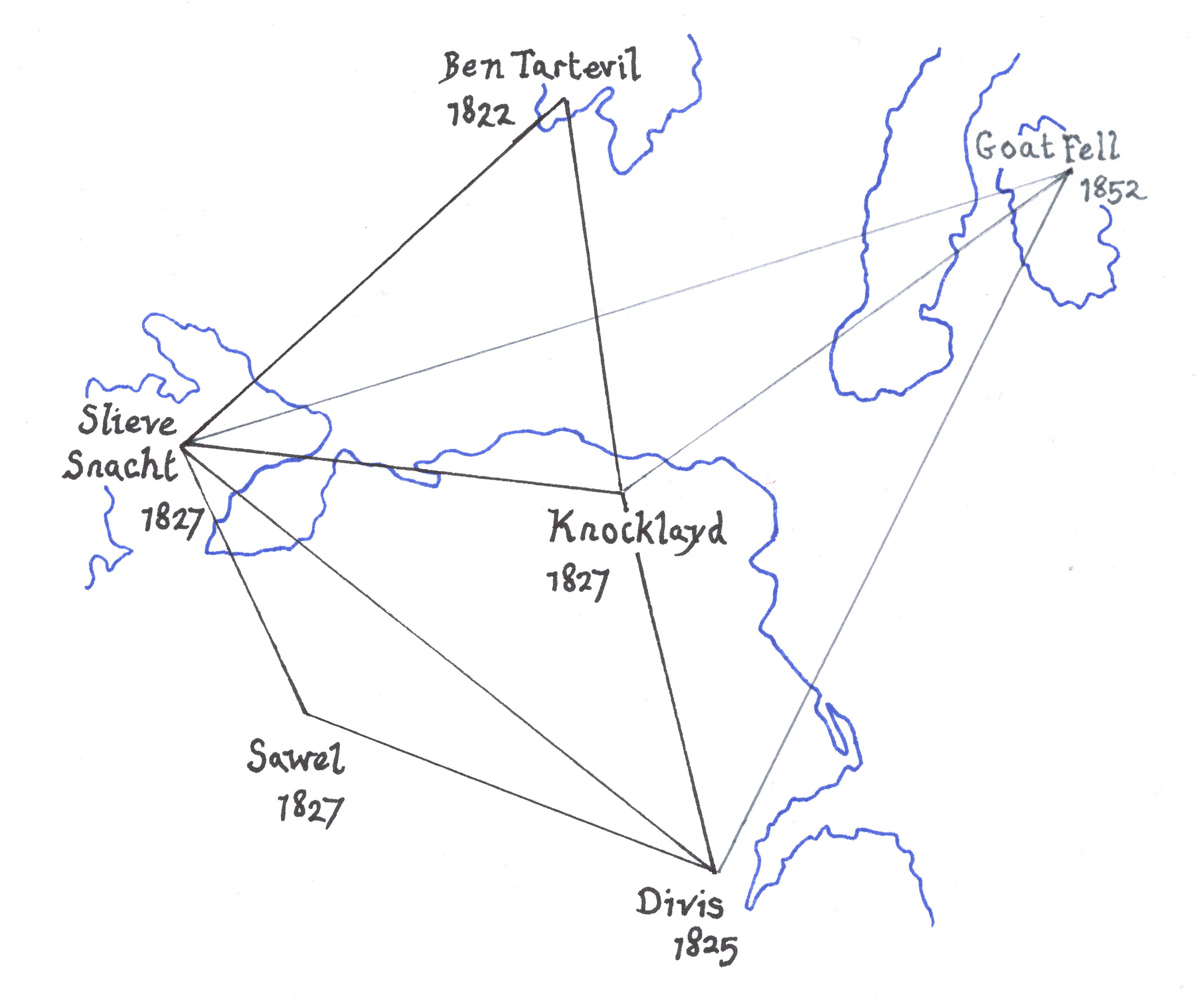
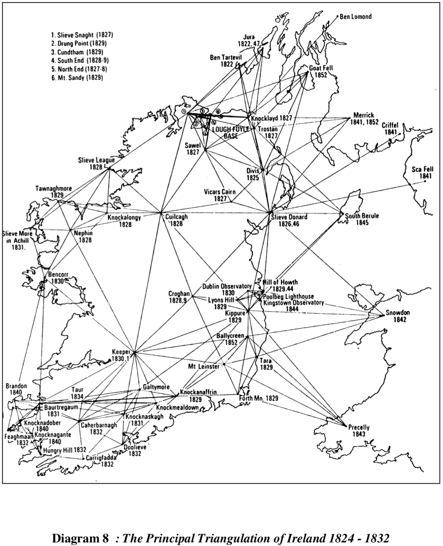
The OS’s initial surveying activities were also based there abouts: a baseline was measured along Lough Foyle, east of Slieve Sneacht, whose summit played an important role (along with Divis and Knocklayd) during the trigonometrical survey of the country. These surveys were made by erecting camps on mountaintops so that signals could be sent from one to the next. The process worked well in clear weather conditions, but just as for Maskelyne on Schiehallion half a century before, months could be spent in wind battered bothies, cloaked in inveterate haze and fogginess (as Colby described it). To speed up the triangulation the OS needed a signalling light stronger than their Argand lamps. In a paper “On the Means of Facilitating the Observation of Distant Stations…” Thomas Drummond described such a light, and on the November 9th, 1825, the mist piercing beam from his new invention was received 66miles away on Divis. Reckoned to be 37 times brighter than Argand, Drummond had invented Limelight. 

From Thomas Drummond. “On the Means of Facilitating the Observation of Distant Stations in Geodaetical Operations.” Philosophical Transactions of the Royal Society of London 116.1/3 (1826) 324-337

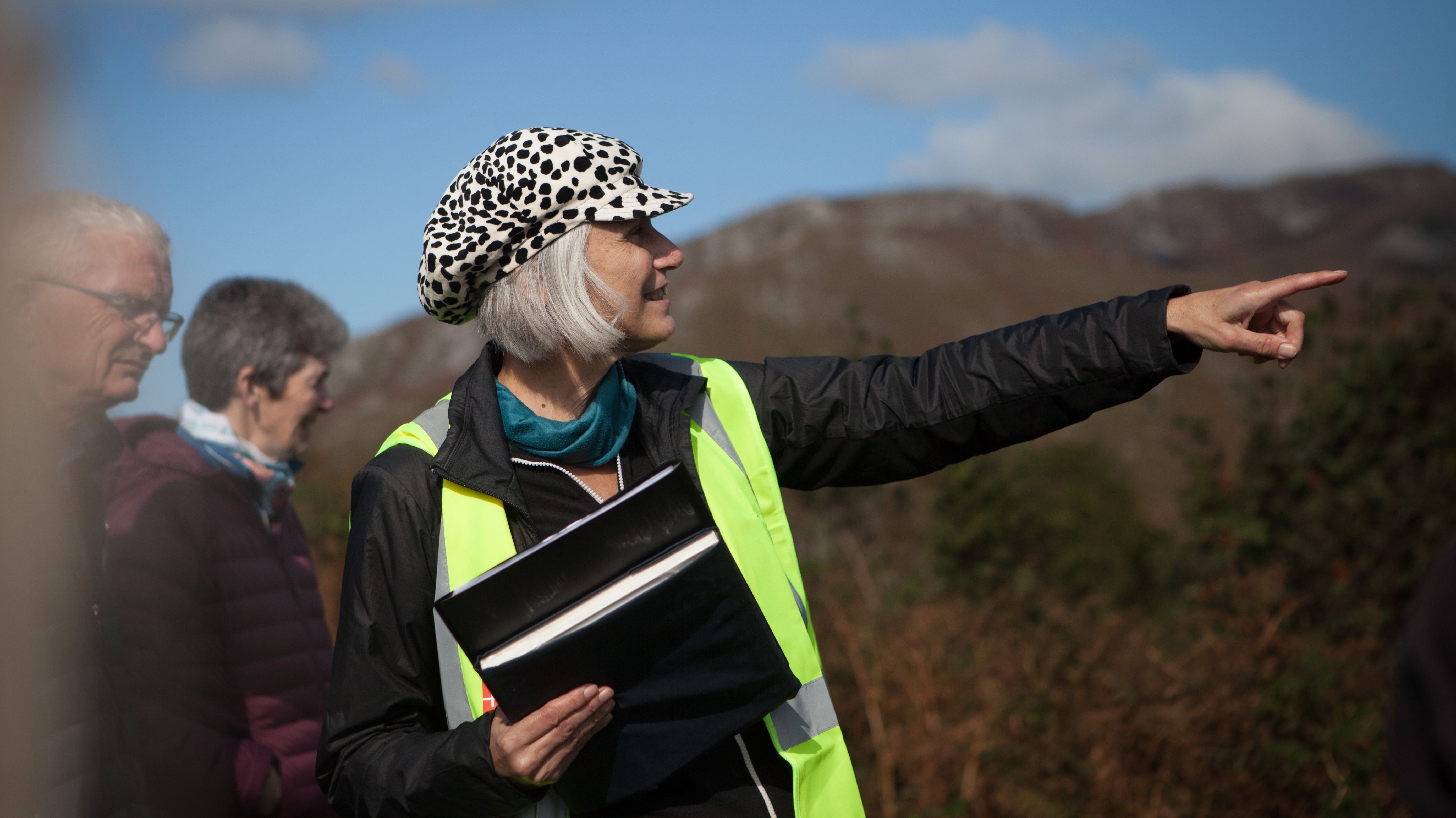
As with Schiehallion, the anniversaries connected with Slieve Sneacht have multiple dates worth celebrating. But we are beginning this summer with a month-long project at Artlink on the Inishowen Peninsula. 

Posted in Uncategorized | Tagged , , , , , , , , , , , , , , , | 6 Comments

Drawing with Altitude

This September, I returned to the rolling hills of Donegal to visit the first district to be contoured by the Ordnance Survey. At its epicentre is a small hill topped with a megalithic tomb. Called Mullagharry, it is easily overlooked, particularly if you compare it with the magnificent mountain Shiehallion – site of the first terrestrial contours. 

My stay was organised by Artlink whose venue is but a stone’s throw from the hill. It was a busy week that began with installing a display of OS hill-sketches, and other historical materials. I then ran sessions filled with mapping and drawing activities at three primary schools. It was lovely seeing the penny drop when, after discussing viewpoint, I watched as their houses were re-envisaged from above. 

The highpoint of my week was leading the walk Drawing with altitude: how mapmakers added hills to maps

On a circuit of Dunree Hill, we surveyed the landscape before us as hill-sketchers and surveyors would have done 200years ago. The first exercise on the walk was to trial a numbering system – used by both the OS and the military – for ordering hills by height on a sketch map by eye. Called Relative Command (RC), the walkers successfully guessed the height order of the hills we could see, beginning with the tallest:

RC no.  Hill                   Height in metres on the map

6.         Bulbin               494m

5.         Urris                 417

4.         Slievekeeragh   389

3.         Aghaweel         330

2.         Calhame           180

1.         Mullagharry      120

Mullagharry, tucked well below the skyline, was the nearest and smallest. I love that this insignificant looking hump looms so large in the story of contour lines. During the walk we also trialled various sketching methods, using bodies for contouring and clinometers to gauge the gradients of slopes. 

Most of the fabulous walking group stayed for my talk (which took place in the same space as the display). 

The contours around Mullagharry, as drawn by the hill-sketchers, makes it appear larger than it is, as though they wished to make a mountain out of a molehill. I discussed this effect during the talk and have an opportunity to dwell further on the subject in November at the Mapping Monuments Conference.

(Artlink is based at Fort Dunree on the Inishowen Peninsula in Donegal. I will be returning there in 2024 for a larger project that will also mark the bicentenary of the Ordnance Survey of Ireland.)

Posted in Uncategorized | Tagged , , , , , , , , , , , , , , | 1 Comment

Mapping Highs and Lows: from the hills of Donegal to the depths of Dover Harbour

Another year passes, and all my plans to post more regularly slip away with it. I’m still digging around in the land of contours though, and if you visit my events page, you’ll see I am back in Donegal soon, specifically, on the Inishowen Peninsula as a guest of Artlink. It’s the place that Ordnance Survey hill-sketchers first experimented with contouring and thus is very dear to my heart. As well as much looking, drawing and thinking, I will be leading a walk and giving a talk about the hill sketchers’ activities. Then on the 21st of September, I will present a talk in Belfast. These events are free to attend… if you are in the vicinity. But a shorter talk, covering similar material will be presented online on the 25th of September, again free, and again details about it are on the events page.

Returning to the theme of digging, I looked at some maps by Thomas Digges on a brief return to the British Library map room (just walking up the stairs there sets my heart to skidding and fluttering with excitement). Taking a brief respite from contours, and wondering what the earliest spot depths looked like, I sought out Digges map of Dover Castle, Town and Harbour, drawn in 1581. According to one source it is the ‘oldest’ use of spot depths, though it seems late to me (if anyone has more information on their early use, please drop me a line). Perhaps they meant just in England, because in 1584 – just three years later – Pieter Bruins was using soundings (spot depths) to draw isobaths. However, it was a pleasure looking at the Digges map, not least for all the lovely depictions of sailing vessels dotted between his two types of spot depth. In open sea, he had marked them in fathoms, whereas inside the harbour walls he’d gauged them in feet and ooze. They are far too sparsely placed to connect with lines (as Bruins had done). 

Posing yet more questions was a copy of another map attributed to Digges, and dated circa 1580, that shows spot heights! I feel sure this date can’t be right, but the description is delightful: ‘The trew height of certayne places above the land of ful seamark’. Curiously, these heights were measured in fathoms, which I associate with depths. A letter of the alphabet marked each hilltop, turret, and cliff edge; a cartouche listed their positions, for example: D. the top of higheft chimney in her ma[jes]ties Lodging – 75. fathoms  

As with the bona fide Digges map, this one is also described as depicting Dover Castle, Town and Harbour, though it also includes inland hills (marked K and L) and cliffs (H and I). Both maps present conundrums I am never likely to plumb the depths of (excuse a terrible pun). I feel much more grounded when looking at hill sketches and contour lines.

  • All images courtesy of the British Library:
  • Ordnance Survey, one inch to one mile, 1st Ed. outline map, sheet 1, Ireland (Malin Head, detail) open shelves
  • Digges, Dover Castle, Town and Harbour, 1581, Cartographic Items Additional MS. 11,815.a. (detail)
  • Second map appears in a volume of “photographs of maps in the possession of the marquess of Salisbury at Hatfield, made by the H. M. Office of Works in 1938.” System number: 004829932 (detail)
Posted in Uncategorized | Tagged , , , , , , , , , , , , , , | Leave a comment

Mapping a Face 

It’s been over a year since I last posted, but with work on the PhD now complete (call me Dr!) I’ve felt an urge to revisit some ‘fascinators’ that hadn’t made it into the thesis. Tidying old files, I rediscovered a “precise contour map” of a face, which reminded me of the face-mountain (Gesichtsberg) I wrote about at the outset of the PhD (that also hasn’t made the final cut). So here they are compared and contrasted.

To give a bit of backstory, much was written by mapmakers on “full-face” representations of place. OS master draftsman, Robert Dawson, thought maps should “be considered a full-face portrait of a county” and a “pictural exhibition to the eye”. V. R. von Streffleur, like Dawson, thought systematic (mechanical) drawing methods – such as contour lines – would not exhibit the character of a face. To illustrate this, he drew two versions of a “face mountain”. Figure 1. Shows contours, interspersed with vertical hachures that – whilst “mathematically correct” – he thought “no one could call this example physically correct”. He is right, when we look at a face, we search out the eyes to tell us something of the character. Yet as the contours on his example are drawn at roughly 5cm intervals, the eyes are missing.

Of figure 2, on the right, he says: “instead of the ideal horizontal lines, one draws the real lines of form existing in nature”. But how can we know if these lines are as ‘precise’ as contours appear to be? How has the upper lip-to-nose distance been measured? Does it matter? And perhaps exaggerating the length of a nose actually better conveys some aspect of a character? 

We get more information – less blank space – if the contours are reduced from a 5cm to a 1mm interval. A. H. Robinson’s face-mountain (or ‘precise contour map’ of a face, as he termed it) has contours so tightly packed that the shape of the eyes begins to emerge. Streffleur’s figure 2 exhibited eyebrows, and a hint of eyelash; small features that help convey character. All hairy protuberances are missing from Robinson’s face. His has a clean, serene quality, or perhaps the expression is just vacant. Which shouldn’t surprise as the original plaster model face drawn from was also devoid of lashes, freckles, and with eyes closed, the face is devoid of expression. 

Robinson approaches the problem of expression with these words: “the most effective visual techniques did not give precise terrain information. Likewise, methods that gave precise terrain values were the least effective visually.” He suggested there is an “incompatibility between striving for visual realism on the one hand and precise attribute values on the other”. Elsewhere his writing was more complementary of contour lines – for their ‘precise values’ – so it was a surprise to read on, and find that, just as one might exaggerate the length of a nose on a drawing, one could equally shift a contour line on a map. A problem with ‘precision’, he suggests, is that “the arbitrary location of contour slices through the terrain … [can] cause omission or distortion of small features … Sometimes it is desirable to shift contours, within the limits of absolute accuracy, to more effectively portray a feature that is prominent in the landscape but not adequately revealed by the accident of geometry.” One wonders then, how often the OS might have shifted the position of a contour line. Perhaps it still goes on?

Now the PhD is done, I hope to have time to post more such ‘out-takes’. The body of the thesis however is to remain ‘on ice’ while I figure out how it might become a book.

  • The images are taken from Arthur Howard Robinson, Elements of Cartography, 6th ed. (Chichester: John Wiley & Sons, 1995), 541 fig. 27.19 captioned: “The vertically lighted plaster model and a precise contour map with a 1mm. interval derived from it. The contours were obtained by photogrammetric methods. (Courtesy G. Fremlin).”
  • And
  • V. R. v. Streffleur, “Der gegenwärtige Standpunkt der Bergzeichnung in Plänen und Landkarten,” [The current situation of Mountain-drawing on plans and maps] in Östereichische Militärische Zeitschrift, IX (Wien, 1868), Tafel no. 3, descriptions from page 233.
Posted in Uncategorized | Tagged , , , , , , , | 4 Comments

Walking Contours

The Parallel Roads of Glen Roy

Roughly 325metres above sea level, all around Glen Roy, nature has etched out a contour line. There’s another just above it at 350m, plus one further down the flanks of the Glen. The lines are so remarkable they were initially considered to be the work of (mythical) men intent on purposes unknown. It took much conjecture and debate in the 1800s (even Charles Darwin weighed in) before the nature of the lines’ ice age construction was finally figured out. 

Robert Dawson, drawings of stones as hills, Image courtesy of The National Archives (TNA)

As life-size emulations of the contour model hills that cadets – as taught by Robert Dawson – learned to draw from, I was keen to visit ‘the parallel roads of Glen Roy’. Last week a friend and I climbed to the middle ‘road’ and walked the contour as far as we could. In the distance, on the other side and towards the head of the Glen, horizontal lines scored the landscape. They are so distinct I had expected to find something akin to a track to follow, not so, our ‘road’ was obscured by waist-high bracken so that neither notional path, nor even our feet, were visible as we stumbled along.

place, map and mark making coincide

My previous post mulled on the appearance of contours and the difficulty I’d had in drawing a contour line as just that: a uniform line. Contour lines on maps are essentially a diagrammatic abstraction, yet like both my drawing attempts and Illuminated contours, the ‘roads’ appeared embellished; pricked out in hues of paler green, or fawn, as they circled the heather and bracken-decked Glen. 

OS Map of the Parallel Roads with benchmarks (detail), courtesy of National Library of Scotland Map Library

Armed with both current and historical OS maps there was much pausing for perusal and then to drink in the view. The oldest map I chose was for the benchmarks that appeared to stud the ‘roads’. Most of the rocks likely to have been scratched by a surveyor’s chisel were too heavily clad in lichen and mosses for a proper inspection. Only one appeared distinct enough to elicit that pleasing sensation of map, mark and precise location bound together in place and time. It heralded a moment of contemplation, firstly of all the renowned men of science who, in the 1800s, walked here before us as they formulated theories and surveyed; then those men of commerce in the 1950s who desired to obliterate the ‘roads’ under a vast Forestry Commission plantation, and finally the tourists, those of us in need of a summer holiday who have headed to Scotland in droves this summer. But where were they? Snagged round the corner on Ben Nevis? We saw not one other soul out walking the ‘roads’. I’m not complaining, but to have such a spectacular and unique swathe of Scotland all to ourselves did seem rather extravagant.

A track on the way back out of the Glen. Not a parallel road, though I’d assumed they’d look like this!

Posted in Uncategorized | Tagged , , , , , , , , , , , , , | Leave a comment

Shading the land of perpetual evening sun

Shading in the shade

Often a timestamp appears to be imprinted onto maps, telling us a time of day, rather than date. It is of course a lie (born of a convention). Hills and trees were drawn onto maps with the long evening shadows of a setting sun. 

Thomas Budgen, OSD 177, Llantriant, 1811, courtesy of British Library maps online (detail)

 Maps followed figure drawing conventions: the body positioned so that a light source is in front and to the left to avoid the drawing hand casting a shadow where they drew. As north appears at the top of the map, so shadows were drawn with a notional light source “from the left extremity of the top of the drawing downwards”.[1]This convenience for right-handers – to avoid casting a shadow upon the drawing – leaves me, and other left-handers, in the dark! Though even in my grandma’s day, left-handedness was frowned on, she had to learn to write and draw with her right hand. 

R. K. Dawson, Essays towards the expression of Ground 1815-16 (detail). Courtesy of the British Library

As contours lines, and other innovations, came into play the shadow convention was rocked. The planimetric God’s eye view would suggest that only the crown of the tree appears – no trunk, no shadow ­– with ‘sun’ at perpetual midday, a view considered by some as “essentially imaginary or abstract in concept”.[2] Although overhead, overall, lighting was seen by some as ‘more correct’ for maps, others found that ‘less talented artists’ who attempted slopes with “no light or dark sides” caused “a monotonous effect” upon their maps.[3]

OS sheet 53, Lancashire, 6”, engraved 1847 (detail). Courtesy of the British Library

The whole shade / no-shade issue resulted in some curious juxtapositions once contour lines began to appear on maps. Contoured hills, devoid of shading, could be dotted with trees that still caught the evening sun. Others insisted the contoured hills should keep their shading, to avoid “pictorial difficulty” they desired contour lines to be limited to faint dots, so as not to “catch the eye unpleasantly”.[4]

contoured model drawing

Wanting to experience drawing with shadows for myself, I set up shaded models hills in the studio. The shocker was not so much the irritation of the shadow cast by my hand – which was slight as I stood to draw and could move around the sketch – no, what was startling was how impossible it was to then attempt contour lines with an even stroke! The impulse to make lines darker on the shadow side was overwhelming, and however much I fought it, the lines still looked more like Japanese cartographer Kitiro Tanaka’s ‘Illuminated Contours’. I feel I’ve only just begun to scratch the surface of shadowy shaded relief. 

shadowy results

[1] C. W. Pasley, Course of Instruction; (London: T Egerton, 1813)

[2] Eduard Imhof, Cartographic Relief Presentation (Berlin: Walter de Gruyter, 1982)

[3] Frome, Outline of the method of conducting a trigonometrical survey, (London: John Weale, 1840)

[4] Scott, “Representation of Ground,” in Papers on subjects connected with the duties of the Corps of the Royal Engineers, (Woolwich: W. P. Jackson, 1863)

Posted in Uncategorized | Tagged , , , , , , , , , , | 4 Comments

The appearance of contour lines

I am the proud ‘owner’ of a short piece just published in Imago Mundi. It outlines my PhD (as I understand it at the moment: change is inevitable). And entailed a rather lengthy editing process for such a short piece; rewrites mounted into double figures. Some of my treasured flights of fancy had their wings shorn – which was a shock – though it was a valuable process to have my words re-evaluated by the eagle eyes of an expert editor.

Mr Burr’s model experiments made it through to the finished article, and some of the material from Using Bodies for Contouring also got a ‘walk in’ role (and had a second outing at the weekend!) Some edited highlights from an early draft appear below:

Anon, Ordnance Survey Drawing 44-1 Courtesy of the British Library online

For many military men in the 1800s contour lines were regarded as too difficult to read and the preference was for traditional pictorial vertical lines to denote mountains ^^^. The vertical hachure was considered the ‘natural’ symbol to represent hilly terrain. If contour lines were seen as ‘too abstract’, other more descriptive systems conveyed an artistic vision of the landscape without defining it well enough to accurately plan a campaign: “Terrestrial maps show us the site of the mountains, their sinuosities, … without saying anything of their height. They give us only a mutilated image of the land”.[1]

Lendy, 1864

Prior to contours, a number of imperfect systems were expounded, explored and trialled; each used hachures, with or without shading, which were often composed using an armature of contour lines that were subsequently removed.[2] A typical treatise of the time contained these instructions:

By degrees you may lessen the number of horizontal lines, and, at last, work altogether without them, drawing the strokes by eye perpendicularly to imaginary horizontal lines.[3]

The role of contours on maps was contested throughout the 1800s, and their adoption was piecemeal. Whilst it was evident pictorial methods were deemed ‘easier to read’, at issue was the artistic abilities of the draftsman with regard to repeatability and uniformity of results. As yet more systems were trialled and embellished, the harder it became to actually apply them correctly: “These methods are very ingenious in theory, but fail[ed] most signally when applied in practice, especially in the field”.[4] In the face of these challenges, contours lines represented a ‘scientific’, repeatable system that did not rely on artistic talent. For the military, another advantage to their adoption – as artillery became more powerful – was the cutting edge precision of contour lines:

what we expect to get from contours is, that knowledge of the ground, that accuracy in estimating slopes, which shall make the artillery officer right about his ranges …[5]

[1] François de Dainville, Expression des nivellemens (1782).

[2] Yolande, Jones, “Aspects of relief portrayal on 19th century maps,” The Cartographic Journal 11 no.1 (1974)

[3] Gordon and Bedford Smith, An Essay on Military Drawing (1812).

[4] Drayson, Practical Military Surveying (1861).

[5] Marsh, Maj., in Papers on subjects, (1874).
Posted in Uncategorized | Tagged , , , , , , , , , , , , | Leave a comment

Peak and Chain (stickmen and millipedes)

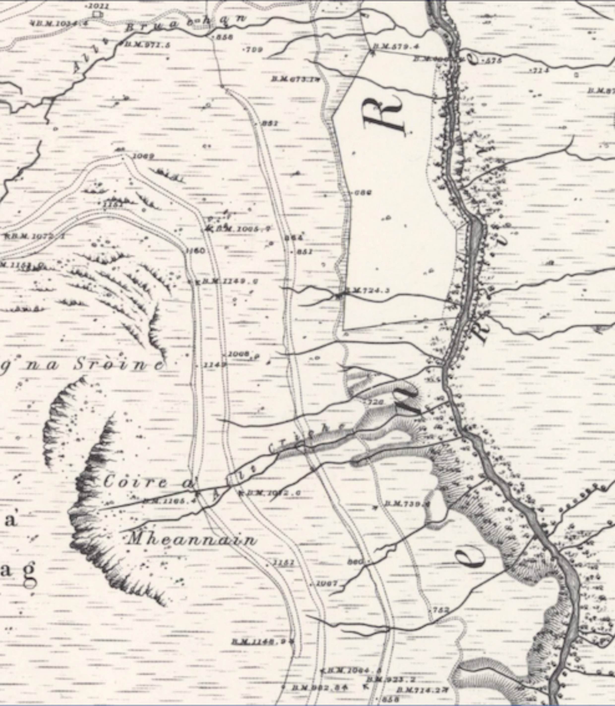
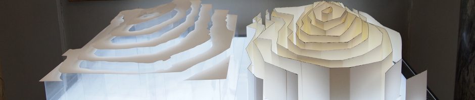
I get stuck on hills. I spend hours poring over mountains on their paper mates; fingers track, stub and circle notable features as I try to transform their graphic qualities into words. Even as I write, my attention is snagged by Schiehallion: eye height on the wall beside me; it beckons me to journey again across the dense swirl of orange contours that ring its flanks. I am happiest when mountains and hills are set in splendid isolation, rising nobly from whatever plateau below, akin to plinth mounted statue. Like mapmakers of yore, I struggle once individuality is compromised; when one hill merges with the next through a series of ridges. How do we mark their barrier like qualities on a map? How best might land be divvied into connected walls of altitude on the one hand, and pools and parcels of river catchment on the other? It’s a conundrum with long roots back through history.
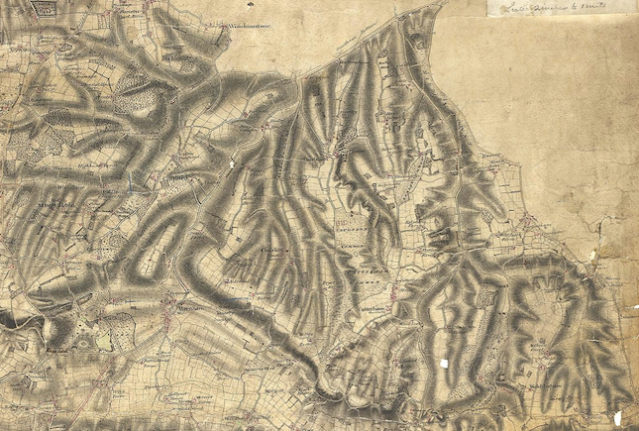
Draughtsmen at work in the early years of the Ordnance Survey reached for myriad options: some chose to furnish interlinking hills with tight and twisting valleys most reminiscent of a ‘cranial cortex’. Thomas Budgen ­veered between rough-barked truncated ‘deer antlers’ for mountainous regions then softened the lines to lend a more rounded tentacle or finger-like appearance to undulating terrain. More commonly chains were announced by the use of ‘millipede legs’ for hachures, or prettier ‘eye lashes’ that were more sparsely drawn than the millipedes. Both these styles left hill summits and valley bottoms blank and relied on the curl of lash or leg to enable us to differentiate high ground from low. 
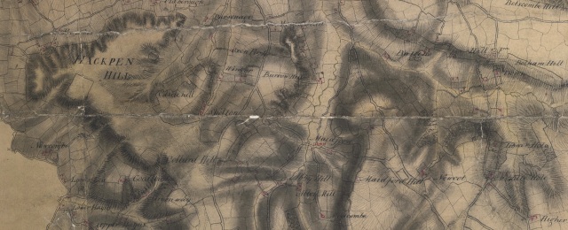
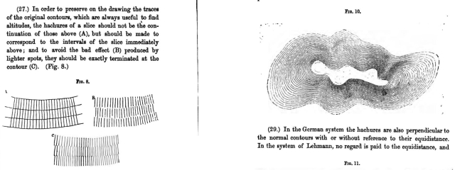
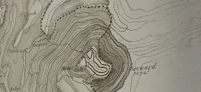
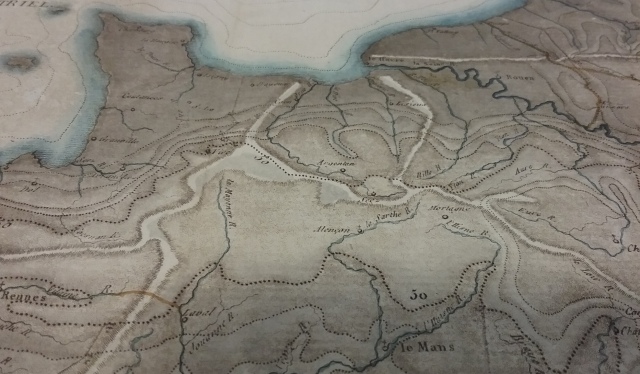
Dupain-Triel was a millipede man. In 1782 he created a map of the ‘main chains’ of mountains (millipedes), and principle courses of the rivers of France. Nine years later he eschewed the millipede to produce one of the earliest printed contour maps. It is the same size and outline of France as the earlier map, only this time the ‘different height of its plains’ is foregrounded and the rivers are not nearly as eye catching. Things get strange on a third map printed in 1802: same size again, same outline; only this one is overprinted so that millipedes and dotted contours collide. Like the stopped clock that is correct twice a day, rarely do these two evocations of the mountain chains accord. We desire maps to tell us the truth, but here Dupain-Triel cruelly dashes expectations; all over the map, millipede chains traverse contours lines in a confusion of impossible highs and lows worthy of an Escher.
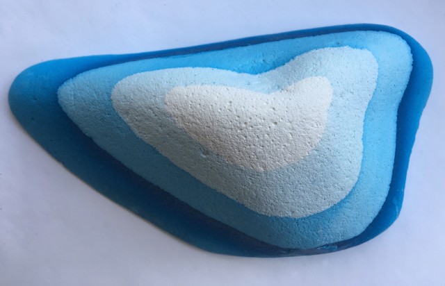
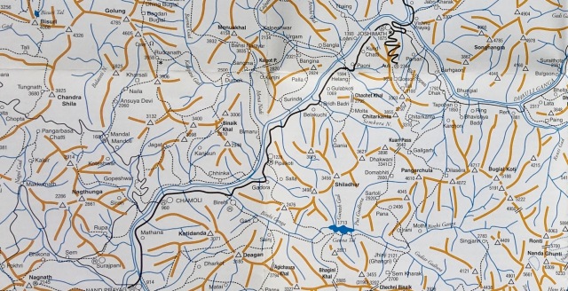
There is one final ‘map of chains’ that has won a place in my heart. Here the paper is strewn with orange stickmen who have joined hands or lost legs, their waists and shoulder joints marked by spot heighted triangles. Rivers systems snake between them in blue while black dotted paths follow their courses before – very occasionally – heading directly for an orange leg or arm, then courtesy of a pass marked by a little bridge symbol “=”, cut across the ridge to join the banks of a different river. I was enjoying looking at its refreshing brevity of style while on a visit to the studio of fabulous ‘mountain artist’ Susan Dobson. The style seemed so novel I turned the map over to identify the maker: Robin G. Collomb ed,.

Who was Robin?

He was my best and oldest friend’s dad. Like Susan, he also loved to walk and draw in the mountains, there is now a website dedicated to his wonderful portrayals of high alpine peaks that bear absolutely no resemblance to the stripped back, diagrammatic orange stickmen. It is remarkable how one person can switch between such contrasting styles. I contacted my friend about the map, I’ll finish here with some words from her:

A guy contacted Dad with some dodgily acquired military maps and Dad reproduced them with a lot of letraset ! … I kept a full set. When we cleared out the house there were all the tracing paper originals with the letraset peeling off.

Images 1 & 3. 
J. L. Dupain-Triel, Carte de la France Où l'on a essayé de donner la Configuration de son Territoire, Par une Nouvelle Méthode de Nivellements, 1802. © The British Library Board, Maps 14312.(3.)

Image 2. 
Thomas Budgen, Ordnance Survey Drawing 89-2, Reigate, 1808. 
Courtesy of The British Library, available online:
commons.wikimedia.org

Image 4. 
Robin G. Collomb ed., Indian Himalaya Maps (Leomann Maps, 2006)
Posted in Uncategorized | Tagged , , , , , , , , , , , , , , , | 2 Comments

Modelling Contours

hills may be imagined as inundated with water, and that every time the water falls…, a mark is run round the surface of the ground at the edge of the water…[1] Paterson, 1882 
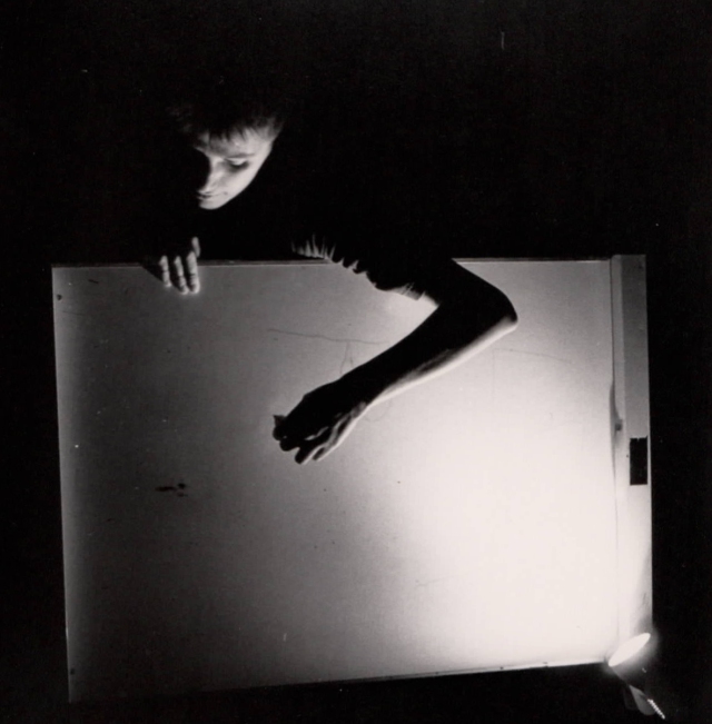
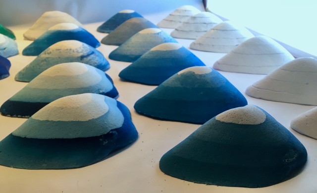
How do you explain what a contour line is? G. D. Burr’s advice was to “Procure a stone somewhat resembling a hill”[2]secure it in a box, pour in diluted Indian ink, then drain it off at intervals so the stone is marked by a series of tidelines: contour lines. I tried recreating his 1839 experiment, yet however precise some of his instructions were, too many important details were missing: type of stone? Ratio of water to Indian ink? Duration required before reducing the level? Numerous experiments later, the crucial element for guaranteed results is deciphered: leaving the stone overnight between levels. 
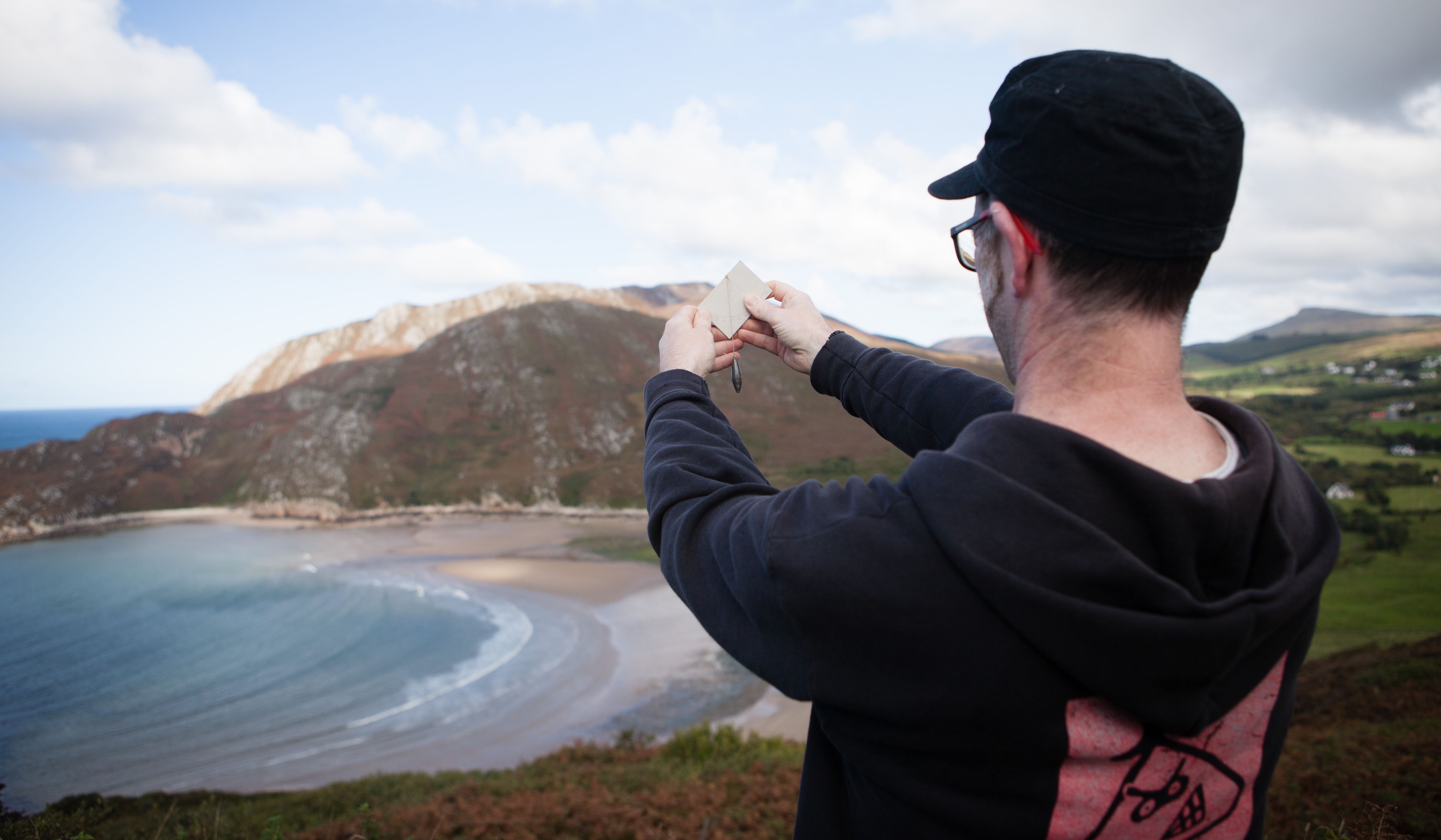
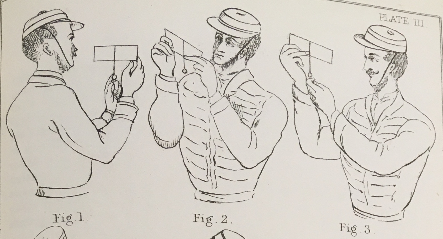
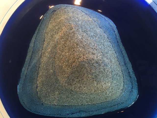
Three years later Basil Jackson described “a very ingenious and striking”[3] adaptation of Burr’s experiment whereby the stone was replaced by “a model in plaster of Paris representing some hilly ground”. From my own trials I know plaster provides an excellent surface for emphasising each ink-stained ring; 
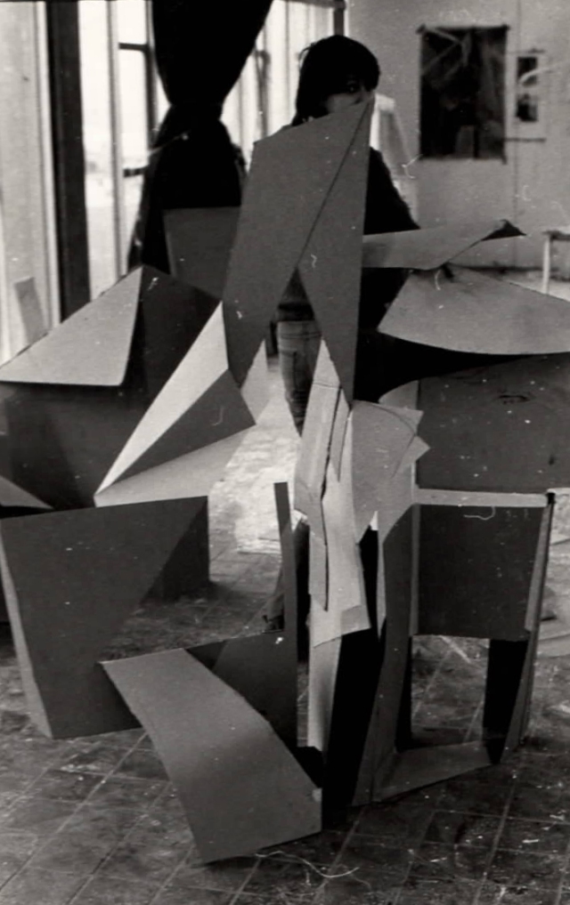
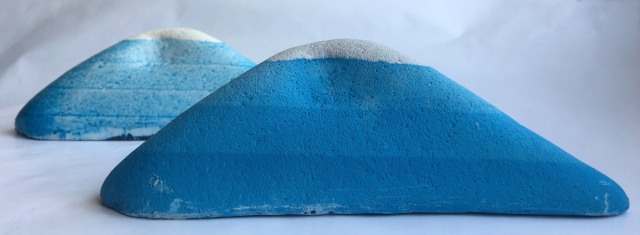
except in Jackson’s version ink isn’t used, the water is clear and: “At every successive fall of the water, he [Burr] traced lines on the model, indicating the curves shown upon its surface by the successive lowering of the water.” I tried recreating this version too, but ‘tracing’ with a sharp point tended to nudge the model, and ink (and charcoal and graphite) smudged in the water. To draw a steady clean line required a very wide shallow container, preferably on a turntable and a very particular pencil. In some respects, this iteration was an improvement, as now the experiment could be ‘performed’ for an audience.
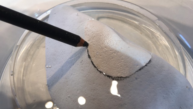
Until I started my own versions of these experiments, I hadn’t realised the implications of the different techniques: ‘flooding events’ versus ‘traced lines’; that the latter lends a more ‘abstract’ diagram-like appearance to the model, this version of the experiment is the one advanced by Alfred Wilks Drayson in the 1860s.[4]

W. H. Richards, 1884, fig.5

Yet, Burr’s original inky version retained the connection his students could make between contour lines and ‘real’ lines as seen in a landscape: receding tides deposit strata of seaweed or debris in a cove: ‘real’ contour lines are laid down before our eyes.[5] Had Burr ditched the stone for a plaster cast, retained the ink and emulated ‘flood’ rather than ‘ebb’ he could have ‘performed’ my version (that produces great results every time). Starting with inky water, subsequently adding only water, at 5min intervals, produces an attractive ‘hill’ ringed in tidelines of ever deeper hues suggestive of peering into the murky depths of a deep glacial lake.

The two versions from the 1800s – the diagrammatic traced line and the pictorial ink-bathed one – proffered two competing views for the depiction of relief throughout the 1800s. Arguments for methodical, repeatable, diagrammatic ‘abstract’ lines, were pitted against those favouring ‘natural’, pictorial and realistic looking lines on maps: contour lines were put to use by both camps.

Stones and plaster models were in use throughout the 1800s to teach cadets to draw (contours) in the classroom; ideas for [re]creating these drawing processes are currently abroad… watch this space.

[1] Paterson, Notes on Military Surveying… (1882) 4.
[2] G. D. Burr, A Treatise On Practical Surveying… (1839) 83–84.
[3] Basil Jackson, A course of military surveying… (1841) 68–69.
[4] Alfred Wilks Drayson, Practical Military Surveying and Sketching… (1861) 67.
[5] W. H. Richards, Text book of Military Topography… (1884) 18 & figure 5.
Posted in Uncategorized | Tagged , , , , , , , , , , | 3 Comments

Childhood experiences in 2 & 3 dimensions

Two Dimensions

At primary school I remember being praised as the first child to paint the sky as a blue wash tracking all the way down the paper. The colour threaded through the branches of a tree where a squirrel sat. The convention among children was to depict the sky as a line, or thin blue band, at the top of the paper. I can’t remember what it was that prompted me to break with tradition.

At secondary school one time, the art teacher set as homework to ‘depict a landscape’. Most pupils copied from famous paintings of romantic or atmospheric rolling hills, evocatively lit with setting sun. Not for a moment did it cross my mind to do this, I set out for ‘cow hill’, a short walk from where I lived. Sitting at the bottom of the hill, the arc of it filled the paper, as was so often, there were no cows present. I painted the different hues of green I could see: the grasses, nettles and cow-parsley up the hill till it met the sky, which, as I recall was a clear blue. I was pleased with the result which only added to my distress when the teacher disparaged the effort: what I had done was ‘wrong’ and not ‘a landscape’ at all. Yet I was perhaps the only one who had sat outside and looked at what I could see. Perhaps I would have got a better mark had I sat at the top of the hill.

Aged around 13, there was a school trip to Wales. One day, the art teacher attached to the centre took us down to the beach to paint. All the children sat facing the sea, except me. I don’t know why I set myself up to paint the cliff behind us, but at some point, the teacher – without passing judgement on the quality of the work – said simply “you are painting the colours of the cliff”, in that moment I knew I wanted to be an artist when I grew up.

performance with flip-chart circa 1985

Three Dimensions

The art teacher at our comprehensive didn’t like me, my artworks weren’t ‘nice’. I preferred painting flattened surfaces where I could focus on colour rather than trying to convey in two-dimensions what was patently in three before me. Instinctively I preferred sculpture where three dimensions were rendered again as three.

In the first year we all did ‘technical drawing’, we sat in forward facing rows on high stools and were given small cuboid models in grey plastic to draw. Our instructions to measure the object and render its surfaces and outline in two-dimensions were clear and lessons had the absorbing quality of a jig-saw puzzle. Taught as an ancillary subject, ours was the first year offered the ‘choice’ which ancillaries to pursue. On offer were woodwork, metalwork, technical drawing, art, sewing and home economics. Previous to our year the classes had been split so the boys would continue in the former three, and girls the latter. It was exciting to be asked to choose and naturally I opted for technical drawing (and Lee Maxwell, who wished to work as a chef, picked cooking). However, when the lists went up, the sexes were split along the old lines. When Lee and I queried this we were brushed off, and neither of us had the wit to complain, we knew we weren’t important.

I can see now why I was so drawn to the problem-solving techniques offered us by the pared down shapes in technical drawing, and the vertical surfaces and colours of hillside and cliff. All my life I have grappled with the puzzle that is to render flat an object or scene onto paper. I have learned to draw perspective, distance, landscapes; but am not ‘gifted’ at it, and do not enjoy it in the way other artists patently do. It still confuses me, and I wonder if my preoccupation with contour lines, a simple – accurate ­– system for rendering three-dimensional terrain flat on paper, stems from this inability to do the flattening myself.

first year at art college, 1979

Posted in Uncategorized | Tagged , , , , , , , , | Leave a comment